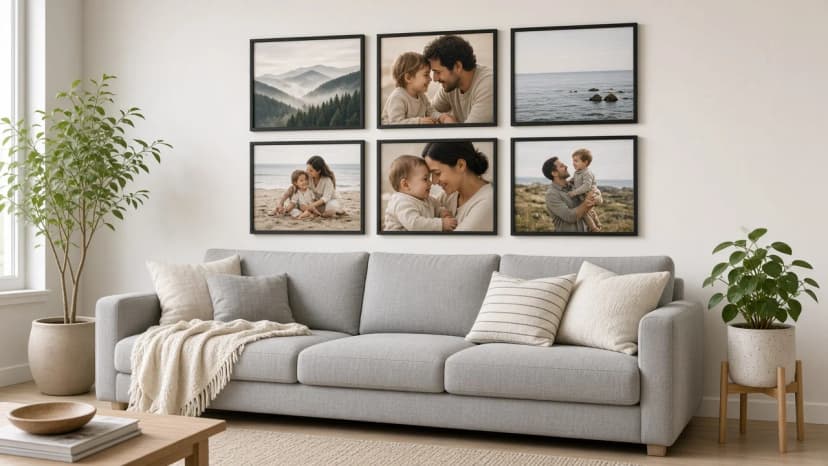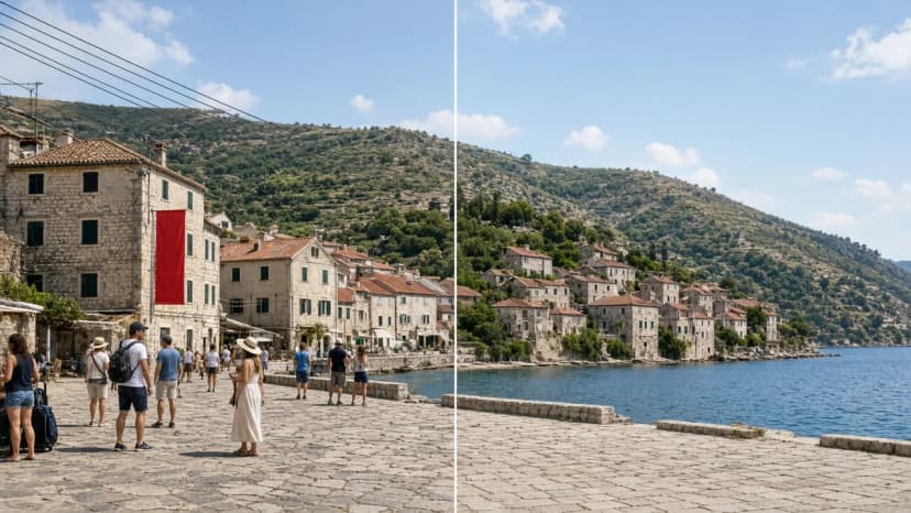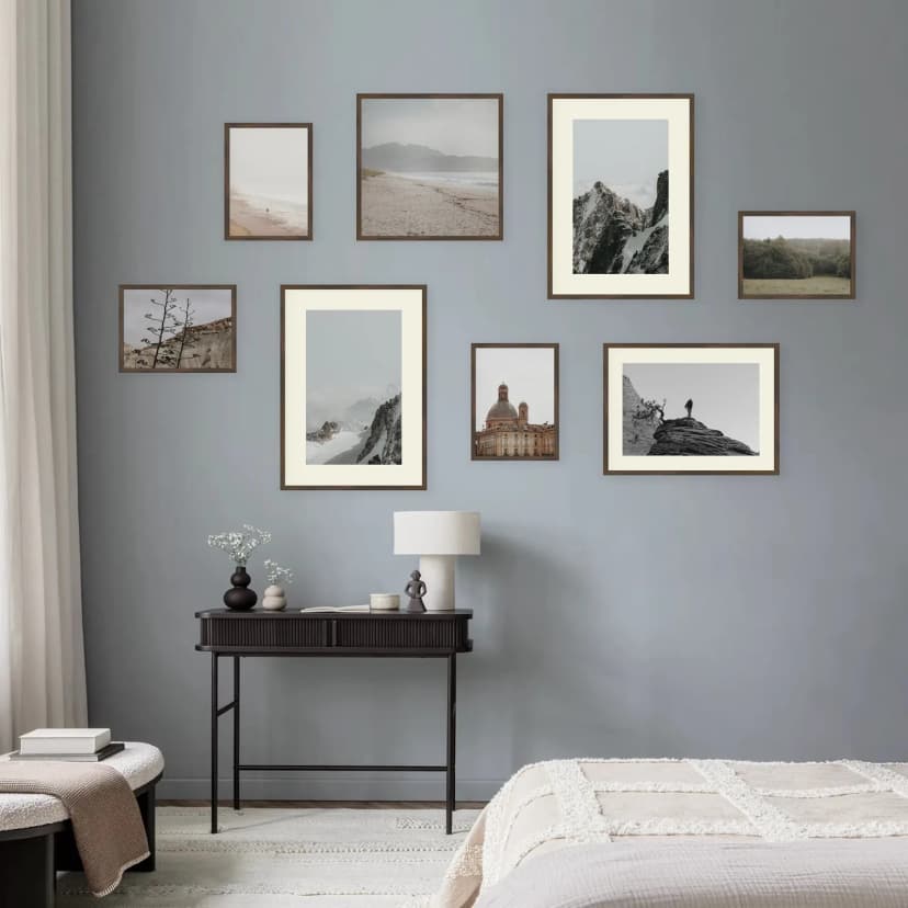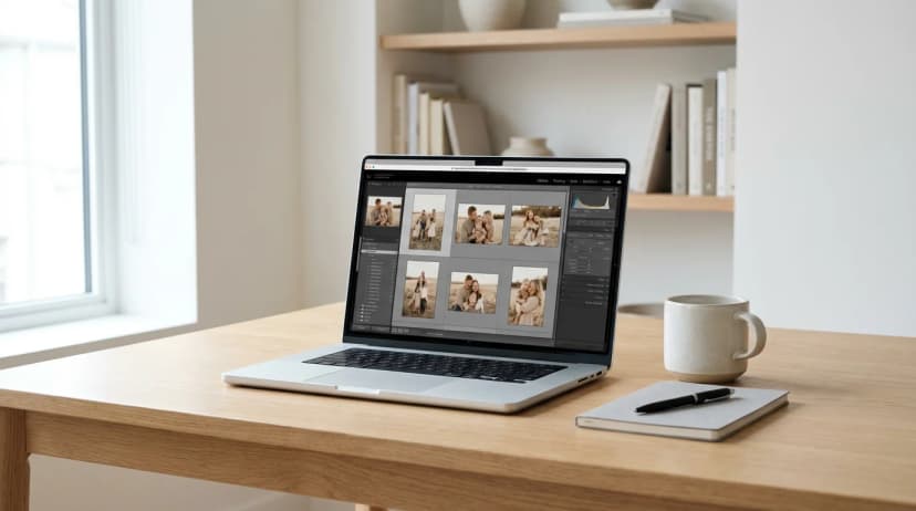
Quick answer: Colour consistency in photo gallery walls is the quality where every frame looks "as if it was shot the same day". Achieve it by standardising three things: colour temperature (warm/cool), contrast, and saturation. You don't need Lightroom — free tools like Snapseed, Photopea, and VSCO deliver 80% of professional results. Three editing levels exist: zero (selection only), preset (one-click filters), and manual (full control). For most families, the "preset" level is enough.
One of the most frustrating moments when building a gallery: you pick 8 favourite photos from the past 3 years, send them to print, the frames arrive — and you realise the summer holiday shot is orange, the school ball photo is purple, and the child's portrait is cold blue. Each photo individually is great, but together they look random. This guide shows how to achieve colour consistency in just an hour, without professional software, so your gallery reads as a deliberate project, not a scattered collection.
What Is Colour Consistency in a Gallery?
Colour consistency in a gallery is the visual quality where all photos in a composition share comparable colour temperature, contrast level, and saturation, so viewers perceive them as one intentional set, not a random assortment. It doesn't mean identical colours — every frame is different — but all frames are "in the same mood". Consistency is built through editing, not selection.
Three Parameters That Actually Matter for Consistency
Forget the fifty sliders in editing software. For gallery consistency, only three matter:
Parameter 1: Colour Temperature (Warm/Cool)
Colour temperature decides whether a photo "leans" towards yellow/orange (warm) or blue (cool). Photos shot under:
- Indoor tungsten bulbs → very warm (orange)
- Bright sunlight outdoors → neutral
- Overcast outdoors → slightly cool (bluish)
- Deep shade on a sunny day → very cool (blue)
Goal for a gallery: all photos in a similar range. Best results: slightly warm (5500–5800 K on the Kelvin scale).
Parameter 2: Contrast
Contrast determines whether a photo looks "flat" (all grey tones close together) or "punchy" (deep blacks, bright whites, lots of drama). Smartphone photos often appear "crushed" because of automatic HDR correction — they look different from camera shots.
Goal for a gallery: medium-to-high contrast, uniform across all photos. Not ultra-dramatic (it tires the eye) but not flat either.
Parameter 3: Saturation
Saturation controls how "intense" colours are. High saturation = magazine-spread colours. Low saturation = muted, film-like tones. Zero saturation = black and white.
Goal for a gallery: muted, slightly reduced saturation (-10 to -20 from original). Such photos stay timeless — they don't age with passing trends of over-saturated frames.
Key principle: Don't chase "perfect colours" on each individual photo. Chase identical editing applied to every photo. Two frames might objectively look worse after editing than before — but if they're edited the same way, together they form a cohesive gallery.
Three Editing Levels — From Nothing to Professional
Level 0: Selection Only (15 minutes)
No editing at all. You simply pick photos with similar character: for example, all from the same holiday, all shot with the same camera in similar light.
Works when: all your photos come from one session or one day, captured on one device.
Fails when: you mix photos from different periods, devices, and lighting conditions.
Level 1: Preset (30–45 minutes)
You apply one preset (a predefined "filter") to all gallery photos. You don't edit each individually — one filter, all photos, one unified "mood".
Tools (all have free options):
- Snapseed (phone, free) — built-in filters like "Portrait", "Smooth", "Pop"
- VSCO (phone, free filters) — famous presets "A6", "C1", "F2"
- Lightroom Mobile (phone, free) — personal and downloaded presets
- Photopea (browser, free) — Photoshop equivalent without installation
How: (1) choose one preset that suits your photos, (2) apply it to each frame, (3) optionally adjust brightness ±10% if a photo is exceptionally bright or dark, (4) export at full resolution.
Works when: for 90% of people wanting a cohesive gallery without diving into Lightroom.
Level 2: Manual Colour Grading (2–4 hours)
You manually adjust temperature, contrast, and saturation on each photo, aiming for consistent values. Requires Lightroom (desktop or mobile Premium) or advanced Photopea knowledge.
Works when: you're a photography enthusiast, have a clear vision, and time to fine-tune each frame.
Not worth it: for most family galleries. The difference between level 1 and level 2 only shows under close examination.
Table: Tools for Editing Gallery Photos
| Tool | Device | Cost | Difficulty | Best For |
|---|
| Snapseed | Phone (iOS/Android) | Free | Very easy | Quick phone editing, level 1 |
| VSCO | Phone (iOS/Android) | Free (with limits) | Easy | Classic film presets, "film" aesthetic |
| Lightroom Mobile | Phone | Free (paid Premium) | Medium | Full control on phone |
| Lightroom Desktop | Computer | Adobe subscription | High | Professional colour grading, level 2 |
| Photopea | Browser (any device) | Free | Medium | Advanced editing without installation |
| Canva | Phone + browser | Free (with limits) | Very easy | Quick fixes, not recommended for galleries |
Step by Step: Edit 9 Photos for a Gallery in 45 Minutes (Level 1)
- Collect all 9 photos in one folder on your phone or computer. View them side by side — notice which are warm, which are cool, which are over-saturated.
- Pick a preset — open Snapseed or VSCO and apply one preset test to any photo. If it looks good, that's your "benchmark".
- Apply the preset to all 9 photos one by one (3–5 minutes each).
- Quick brightness fix: if a photo looks too dark or bright after the preset, adjust the "exposure" slider by ±10%.
- Export at full resolution (Snapseed: Export → Save Copy; VSCO: Export → Full Size).
- View all 9 again side by side — they should look like one set. If one "stands out", go back and adjust only that one.
- Order your print — all 9 photos at once from one supplier.
How to Choose a Good Preset
Three rules:
- Keep skin tones natural. Many "vintage" presets give skin an unnatural green, yellow, or purple cast. For family galleries, pick presets that preserve natural skin tone.
- Avoid extreme filters. Heavily blue-tinted "Tumblr" aesthetics and dark "matte film" shadows look great for a month, then become tiresome. Choose neutral presets.
- Test on 2–3 different photos (portrait, landscape, interior) before applying to your whole gallery. The same preset can excel on a portrait and fail on a landscape.
Why the Printing Company "Can't Fix It" — and Why That's True
You might hear: "don't bother editing, the printer will fix it". They won't. Printing companies:
- Don't know your photos or the gallery context
- Don't realise 9 frames should form one cohesive set
- Print each photo with camera settings ("whatever came in the file, we print")
- If 5 photos are warm and 4 are cool — after printing, 5 will still be warm and 4 still cool
The only thing a printer can adjust is colour fidelity on their specific paper and ink — for instance, Framky uses pigment printing with a set of 12 inks, which renders broad, accurate colour. But consistency between photos is your job before you send them.
When Editing Doesn't Matter for Your Gallery
Three situations:
- Black and white gallery — converting colours to black and white automatically eliminates 70% of consistency problems. See the guide on mixing black & white with colour photos.
- All photos from one shoot (e.g., entire gallery from one wedding photographer) — the photographer already did the editing for you.
- "Symbolic" gallery without people — landscapes, details, patterns. Colour differences are less noticeable than they are on faces.
FAQ — Questions People Ask
Do I need Lightroom for a cohesive gallery?
No. Free tools Snapseed and VSCO deliver 80% of Lightroom's professional effect. For most family galleries, that's more than enough. Lightroom is worth the cost only if you're a photography enthusiast wanting full control over manual colour grading.
How do I get all photos in the same "mood"?
Apply one preset (filter) to all gallery photos. Step by step: (1) open Snapseed or VSCO on your phone, (2) load the first photo, (3) pick a preset you like, (4) save it and apply the same preset to every other photo. That's the whole "colour grading" process most galleries need.
Do black and white photos work with colour ones?
Yes, with the right approach. Standard rule: 80/20 ratio (80% of one type + 20% of the other) or zoning (e.g., 4 black & white photos on one side, 4 colour on the other). The guide on mixing black & white and colour covers this in detail.
Which VSCO preset is best for family galleries?
Safest picks: "A6" (slightly warm, filmic, good for portraits), "C1" (classic, neutral) and "F2" (muted, universal). Avoid heavily stylised presets (e.g., "HB1", "AL3") — they're striking at first but quickly look dated. Test a preset on 2–3 different photos before applying it to your whole gallery.
Are smartphone photos good enough for a gallery?
Yes, if your phone is from 2020 or newer (iPhone 11+, Samsung/Pixel flagships). Minimum resolution for a 30 × 40 cm frame is 3000 × 2000 pixels, which every modern phone meets. The issue isn't resolution — it's editing. Smartphone photos have automatic HDR correction that gives them a "smartphone look". A Snapseed preset levels that.
How do I fix photos shot indoors under artificial lights?
Evening photos are typically very warm (orange) from LED or halogen bulbs. Fix: open Snapseed → Tune Image → Warmth → reduce by 20–30 points. This shifts the photo from "orange" to neutral. Then apply a preset like you would any other photo in the gallery.
What's Next
If you're mixing black & white photos with colour, read the guide on combining black & white and colour — it's a separate project with different logic than a single colour palette. For general frame selection and sizing, the guide "How many photos for a wall gallery" helps. If you're building a gallery from pregnancy and baby's first year, the guide on that subject is especially relevant — colour consistency matters across 12 monthly sessions.
After editing, order your gallery from the Framky configurator — pigment printing with 12 inks reproduces your edited colours with high accuracy.