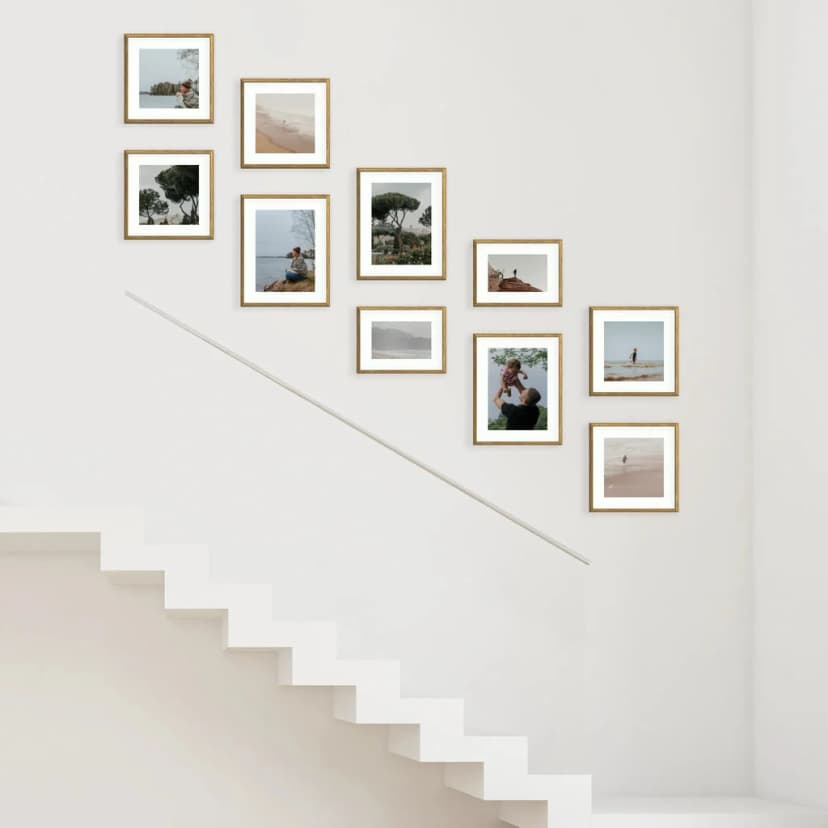
How to Hang a Photo Gallery Wall on Stairs
Hang a staircase photo gallery in about 15 minutes: measure the rise, pick a stepped layout, use Framky’s 1:1 template — no drill.
5 min read
Article
How to mix black and white and colour photos in one gallery — 80/20 proportions, zoning, colour accent. Three rules without compromise.
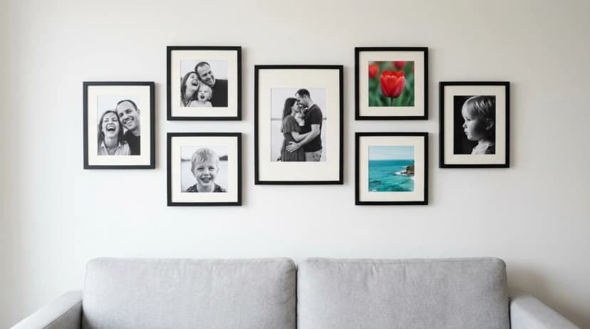
Short answer: Black and white and colour photos can be mixed in one gallery, but only following one of three rules: (1) 80/20 proportion — decisive dominance of one type, the rest as accent; (2) zoning — all black and white on one side of the gallery, all colour on the other; (3) colour accent — one dominant colour (e.g. red, yellow) paired with black and white frames. 50/50 proportions don't work — they look like "I couldn't decide."
Black and white photography has different emotional character than colour. When you mix them without a system, visual discord emerges — the eye doesn't know whether to focus on form (as in black and white) or colour (as in colour). This article shows how to use that discord intentionally instead of ignoring it — three rules that deliver a professional "planned composition" effect, not "random mix."
Before we move to mixing rules, it helps to understand what happens in the viewer's mind:
These two types activate different viewing modes. Without compositional logic, the brain "freezes" and the gallery looks chaotic.
What it means: 80% of photos in one convention (e.g. all black and white), 20% in the other (1-2 colour accents).
How it looks: 10-frame gallery — 8 black and white family portraits + 2 colour landscape accents (e.g. sea photo, sunrise).
Why it works: the viewer's brain assigns the gallery to one type ("this is a black and white gallery"), and individual colour frames feel like deliberate highlights. Colour becomes an "exclamation mark," not competition.
Proportions for different gallery sizes:
| Number of frames in gallery | Dominant type | Accent |
|---|---|---|
| 5 | 4 | 1 |
| 6 | 5 | 1 |
| 7 | 6 | 1 |
| 8 | 6 | 2 |
| 9 | 7 | 2 |
| 10 | 8 | 2 |
| 12 | 10 | 2 |
Key principle: colour accents in a black and white gallery should be SCATTERED, not grouped. If you have 2 colour accents in a 10-frame gallery, place them on opposite sides — not next to each other.
What it means: You divide the gallery into clear "zones" — e.g. left and right halves. One zone is black and white photos, the other is colour.
How it looks: 8-frame gallery — 4 black and white on the left + 4 colour on the right. Or: 4 black and white in top row + 4 colour in bottom row.
Why it works: zoning gives the viewer's brain a clear instruction: "now you're looking at the black and white zone, now the colour zone." Each zone is its own emotional "world," and their juxtaposition creates a narrative of contrast.
When to use: when your wall is roughly square (divides into halves) or you have a narrative like "past → present" (black and white old photos + colour contemporary).
Example zoned layout:
| Top row | Bottom row |
|---|---|
| Portrait B&W | Landscape colour |
| Portrait B&W | Family colour |
| Portrait B&W | Holiday colour |
| Portrait B&W | Pet colour |
8-frame gallery, 4 black and white portraits on top as "family background," 4 colour frames of daily life below as "here and now."
What it means: All photos are black and white, but one colour is "retained" — e.g. red dress, yellow umbrella, blue sea. This technique is called "spot colour" in photography.
How it looks: 6-frame gallery — all black and white, but each frame contains one colour element (e.g. red balloon in child's hand, red tulip in vase, red roof in distance).
Why it works: this technique gives the gallery exceptionally cohesive character. The brain recognises "same colour element everywhere" and connects all frames into one story.
Technical note: requires photo editing in Photopea, Lightroom or GIMP (free). You won't achieve this with Snapseed presets alone. For 5-7 photos, "spot colour" editing takes 2-4 hours, so this is an advanced option.
Half the frames black and white, half colour. The brain doesn't know which is "background" and which is "accent." Effect: looks like "I couldn't decide what to choose."
Solution: commit to 80/20 (or 70/30) with one type dominant.
5 black and white photos + 2 colour, but the 2 colour are side by side. The brain sees "big colour patch" in one spot — which looks like design error, not deliberate accent.
Solution: separate colour accents — place them on opposite sides of the gallery.
One black and white photo with strong contrast (deep blacks, bright whites) next to a "flattened" one (all grey) looks awful. The brain sees "one good photo and one weak."
Solution: before applying black and white filter, equalise contrast across all photos to similar level.
| Gallery theme | Number of frames | B&W : colour proportion | Example |
|---|---|---|---|
| Multi-generational family | 9 | 7 : 2 | 7 grandparents/parents portraits B&W + 2 current frames with grandchildren colour |
| Travel together | 6 | 4 : 2 | 4 portraits of partner on travel backgrounds B&W + 2 landscape colour |
| Childhood → adulthood | 8 | 6 : 2 | 6 childhood photos B&W + 2 current colour |
| Our street/neighbourhood | 7 | 5 : 2 | 5 architectural B&W + 2 colour accents (flowers, sunset) |
| A passion (e.g. cycling) | 6 | 4 : 2 | 4 bike and detail portraits B&W + 2 route landscapes colour |
80/20 rule: for every 5 photos in a gallery, maximum 1 should be colour. For a 10-frame gallery — maximum 2 colour. More than 20% destroys the "one type dominance" effect and the gallery looks chaotic.
Partially. Sepia is one colour (brownish) overlaid on the photo — more "monochromatic" than pure black and white, but with a distinct tonal cast. In a gallery it's a "third type" — doesn't mix well with pure black and white or full colour. An "all-sepia" gallery works, but mixing with other types rarely succeeds.
Yes — every editor (Snapseed, VSCO, Lightroom, Photopea) has black and white conversion. Important: converting colour to black and white produces slightly different results than a photo shot in monochrome mode. Contrast and tone may need manual tweaking. For a family gallery, Snapseed's "auto" conversion is enough.
Portraits with strong light and shadow (deep contrast between bright and dark areas), frames with clear structure (architecture, snowy landscape, bare trees), photos with emotion (laughter, tears, concentration). Weak in black and white: "pastel" frames with delicate colours (flower fields, beaches, sunsets) — removing colour strips away what made them interesting.
Not if frames are varied. 9 portraits in "studio, plain background" style is genuinely dull. A mix of portraits, landscapes, details, action shots — all black and white — is striking and timeless. Key: thematic variety within one colour convention.
Only if you're a photography enthusiast with time for manual editing in Photopea or Lightroom. For a typical family gallery, 80/20 proportion gives 90% of "spot colour" effect with 20% effort. Reserve spot colour for special projects — e.g. a wedding anniversary, where you want something truly unique.
After choosing your mixing strategy, revisit the basics of editing — Gallery Colour Consistency shows how to equalise contrast across all black and white photos. For frame proportions and sizing, How Many Photos in a Gallery Wall helps. If your gallery spans different decades, check How to Choose Wedding Gallery Photos for an example of narrative selection.
You can print a mixed black and white and colour gallery in the Framky configurator. Pigment printing with a set of 12 inks captures both deep blacks and saturated colours with high fidelity.
Sign up and we'll send you a code with a bigger discount than the shop offers — plus occasional inspiration for your photo gallery wall.
Hang a staircase photo gallery in about 15 minutes: measure the rise, pick a stepped layout, use Framky’s 1:1 template — no drill.
Hang a photo wall in the stairwell: measure the rise, pick a layout along the banister, use a 1:1 template. No drill, about 15 minutes.
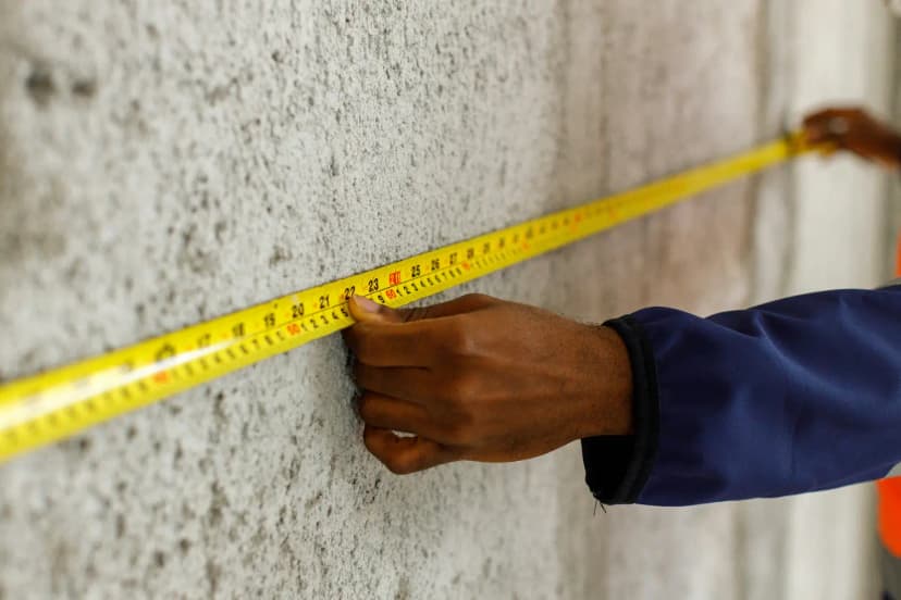
See gallery wall layouts with real sizes — 3, 5, 6, 8, 10+ frames. Match a Framky kit to your wall width, then hang with a 1:1 template.
Give it a try?
See how it works